
Target Audiences
The primary audience we are targeting with our music video is 16-24 year old females who are fans of dance music. The strong female lead of our artist can act as an aspirational figure for this demographic, and our use of the stereotypically feminine colour pink across all our products may add appeal for some members of this audience. Here is a profile of this audience group's key characteristics:
The secondary audience we are targeting is 16-24 year old males who are fans of dance music. Here is a profile of this audience group's key characteristics:

 The tertiary audience we are targeting is fans of the dance genre of any age. As they are already a fan of the genre, the music should be enjoyable for them even if no other aspects of our products appeal to them.
 As all three of our target audiences groups are fans of the dance genre, we have followed many conventions of the genre in order to engage the audiences and meet their expectations.
Blumler and Katz's uses and gratifications theory states that reasons for audience consumption of media texts can be split into four categories:
- Diversion
- Personal relationships
- Personal identity
- Surveillance
We made choices to attract our three target audiences based on the ideas of using media texts for 'personal identity' and 'personal relationships'.


We also made choices using the theory that audiences consume media products for pleasure. In the case of our target audiences, we used festival imagery and created a clubbing-style atmosphere using dancing to appeal to them. This is because a main characteristic of our audiences is that they enjoy clubbing, partying and going to festivals, and so we felt that this iconography and atmosphere would give them pleasure to watch as the can relate to the lifestyle.
 |
| Festival iconography and clubbing atmosphere in the balloon scene |
Audience Feedback
During ConstructionWe found audience feedback extremely useful when constructing our music video, album cover and website as it helped us make important decisions.
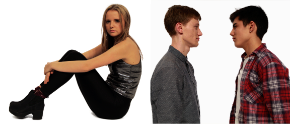
We had decided to use blue, pink and white as the colour scheme for our banner as we felt that the gender typical colours of pink and blue would represent both the female lead of our artist and the two male DJs. However, we could not decide whether using pink or blue as the most prominent colour would best appeal to our target audiences. Below are the two options for the colour scheme we had to choose between:


After asking several males and females aged 17 and 18 which appealed to them most, we concluded that the banner with blue as the most prominent colour was the one to go for.
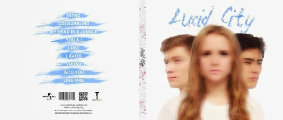
Similarly, at one point in the process of creating our album cover, we had produced several versions:

Out of these three variations, we could not decide which looked best. We sought advice from 17, 18 and 19 year old fans of the dance genre, and found that they preferred the image without a pattern to the versions with a pattern. We found this surprising, as we knew that bright colours and images are a convention of the dance genre (particularly the laser style pattern, as it connotes live music which is heavily associated with the dance genre). However, we listened to this feedback and continued to work on the cover without a pattern over the central image as it was evident that this would be more attractive to our target audiences.
After producing a rough cut of the music video, we asked two members of our primary and secondary target audiences for feedback on the video at that point and filmed their responses.
Gavin, a 17 year old, male fan of the dance genre:
However, he noticed that at one point in the video there were too many paint shots in a row and that we need a wider variety of shots. He also suggested that in the incomplete section of the video we could try using very fast cuts between clips in the build up to the chorus. We took this advice on board and made the necessary changes as we felt that a lack of variety may be boring for the viewer and stop us from achieving the montage-type sequence we were aiming for, and because we wanted to increase the appeal to our target audiences. After trying out the editing suggestions Gavin had made, we showed the video to other members of our primary and secondary target audiences. They all agreed that this version was better than the last cut, and so with this feedback in mind, we kept the changes we had made.
Izzie, an 18 year old female:
From this we learned that although the narrative was clear, a smoother ending may have wrapped it up better. We felt that this opinion was useful as it came from a member of our target audience, however as no one else we had asked for feedback picked up on the issue, we decided not to change the ending, as it would have meant re-thinking the whole concept for the ending to be able to use different shots.
Izzie also commented on the website and the album cover. She found the website was well layed out and easy to navigate, with some interesting content. She also thought that the album cover was eye-catching and reflected the songs well (mainly 'My Head is a Jungle'). I felt that this was useful feedback as we could trust that so far we had made suitable decisions to engage our target audiences.Post-production
After uploading our music video online, we conducted a survey using surveymonkey.com to get some feedback on it. We felt that audience feedback was important to see if we had reached our target audiences and if our video had met their needs. Here is the survey we created:
Create your free online surveys with SurveyMonkey , the world's leading questionnaire tool.
To see if the video had appealed to our primary target audience, I looked at individual responses to the survey from this group. This Powtoon shows what I learned from the feedback.
 I also looked at the overall feedback from the survey. Although the respondents were primarily aged 16-24, there was also feedback form other age groups. However, this feedback also has the potential to be useful as our tertiary audience is dance music fans of any age.
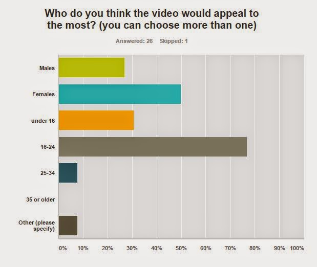 A large number of the respondents thought that the music video would appeal to females and people aged 16-24, which suggests that some elements of our video would be successful in appealing to our primary target audience. However, a significant number of respondents thought that the video would appeal to those under 16 years old. On the one hand, this means that our video has a wider appeal than intended and is therefore positive feedback. On the other hand, this means that despite the drug references, our video may not have come across as mature as we had intended, which could be seen as negative feedback. In hindsight, it seems that we should have given our video less of a 'poppy' feel and made it slightly darker to successfully target our intended audiences.
Nearly 30% of the respondents thought that the video would appeal to males, which we found was generally true from the responses shown below.
 |
| Click to enlarge |
From this feedback, it is evident that members of our secondary target audience enjoyed the video. The above respondents are all males aged 16-24, two of whom enjoy dance music. The feedback was positive, with the respondents rating their enjoyment of the video highly and all having the opinion that it would appeal to 16-24 year olds. However, one of the respondents commented that the Alice in Wonderland footage did not look great, suggesting that we had not reached this audience with the nostalgic appeal of old Disney film footage as we had intended to. Another respondent suggested that we could have used strobe lights or lasers in the performance scenes to improve it, but these were not available for us to use in our production. However, looking back, I think we could have used brighter, white spotlights to imitate the look of strobe lights and lasers (instead of softer, coloured lights) in order to better target our audiences.
 One question we asked people was which section of the video they felt was the most prominent. From the responses, I learned that the paint fight scene was the one that really stood out for most people. As it was just one part of the narrative that stood out, this suggests that the other sections lacked prominence and therefore it seems that we should have tried to keep the montage more equally weighted between the two main narrative set-ups to make them both as memorable as each other.
Despite questions such as the one above providing data that is quick and easy to read, I learned the most from the questions that collected qualitative data as people gave reasons for their opinions. For example, the question "What do you think worked well in the video, and what would you improve?" provided us with detailed feedback. Here are three people's answers:


Reading the responses to the survey, I found that there was some ambiguity surrounding the narrative of the video as a few people said they didn't understand it (demonstrated by the answers shown below).


This may be because, as one respondent to the survey pointed out, the white scenes at the start "could have been a bit longer make the narrative clearer". On reflection, I agree that spending more time setting up the storyline at the start would have made the rest of the narrative much clearer. However, due to the timings of the song this was not possible, which is why we decided to cut the white scenes short.
Despite this, there were also some positive reactions to the narrative of the video, shown in these responses (below) to the question "Did you understand the narrative? Could you explain it?".


This suggests to me that we were successful in conveying the narrative of the video as each person in the answers above seems to get the gist of what was happening. For example, they understood the "balloons and paint stuff" was a portrayal of the lyrics 'My Head is a Jungle', and that it is all happening in her head which is a "mess". The last response is extremely positive as they summed up the outline of the narrative in one sentence. This shows that, for at least some people, the narrative was easy to follow.
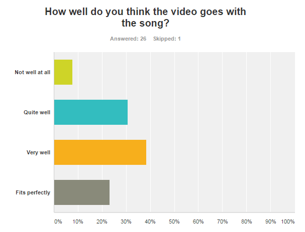 Of all the people we asked, a majority thought that the visuals fitted with at least "quite well" with the song. This suggests that we connoted the genre of the song and interpreted the lyrics well. However, about 10% of the respondents to the survey thought that the video did not fit well at all with the song, suggesting that it was unclear to some how the visuals linked to the lyrics, the music, or the genre of the song. We did frequently cut to the beat when editing our video, however, I feel that we could have made our video more stereotypical of the dance genre by making the sets less bright and colourful, so perhaps this is why a section of our audience felt that the song did not go with the video. Also, if we had interpreted the lyrics of the song more literally, the visuals may have made more sense.
Website and Digipak
After we had produced the final version of our website and digipak, we asked a group of people from each of our three target audiences for feedback on the two artefacts. Here is what they had to say:


In conclusion, the audience feedback we received throughout the construction stage was incredibly useful as it gave us an insight into the tastes of our target audiences, rather than our own personal tastes which we had to stop letting bias our decisions. Our post-construction feedback was also useful as it made me realise how we could have better appealed to our audiences. However, it seemed that the appeal to our intended target audiences was successful in some ways, which was also helpful to learn from the feedback, as it meant that generally we made the right choices and decisions to target these audiences.
No comments:
Post a Comment